I failed to find Kahneman’s book in the economics section of the bookshop, so I had to ask where it was. “Oh, that’s in the psychology section.” It should have also been in the statistics section.
He states that his collaboration with Amos Tversky started with the question: Are humans good intuitive statisticians?
The wrong brain
The answer is “no“.
We are good intuitive grammarians — even quite small children intuit language rules. We can see that from mistakes. For example: “I maked it” rather than the irregular “I made it”.
In contrast those of us who have training and decades of experience in statistics often get statistical problems wrong initially.
Why should there be such a difference?
Our brains evolved for survival. We have a mind that is exquisitely tuned for finding things to eat and for avoiding being eaten. It is a horrible instrument for finding truth. If we want to get to the truth, we shouldn’t start from here.
A remarkable aspect of your mental life is that you are rarely stumped. … you often have answers to questions that you do not completely understand, relying on evidence that you can neither explain nor defend.
Two systems
A goodly portion of the book is spent talking about two systems in our thinking:
- System 1 is effortless, fast, completely heuristic, and unconscious
- System 2 takes work, is slow, and sometimes uses logic
Kahneman is careful to note that this division is merely a model and not to be taken literally. There are not sections of the brain with System 1 or System 2 stamped on them.
We started with the question of statistical intuition. Intuition implies System 1. Statistics implies counterfactuals — things that might have happened but didn’t. System 1 never ever does counterfactuals.
System 1 will attribute significance that isn’t there. That’s survival: seeing a tiger that isn’t there is at most embarrassing; not seeing a tiger that is there is the end of your evolutionary branch. Our intuition is anti-statistical — it doesn’t recognize chance at all, and assigns meaning to things that are due to chance.
One of the chapters is called ‘A machine for jumping to conclusions’.
Regression
The chapter on regression is the best explanation of the phenomenon that I know. Chapter 17 ‘Regression to the Mean’ should be supplementary reading for every introductory statistics class.
Piecharts
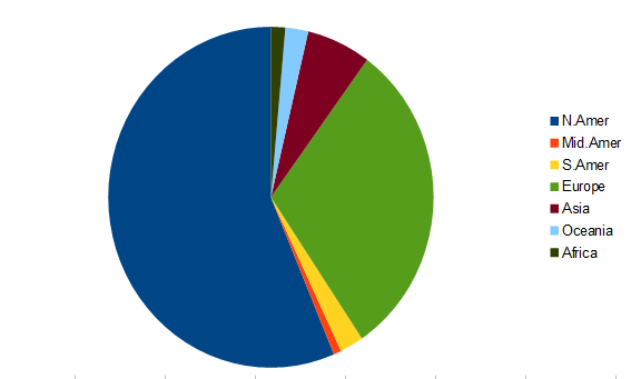
Pie is for eating, not for charting.
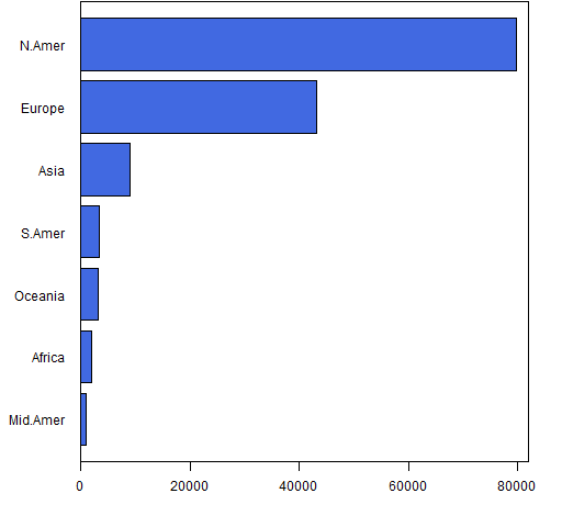
One of our System 1 modules is comparing lengths. (Brain Rules describes the fantastically complicated mechanism of our vision.) Understanding lengths is effortless and almost instantaneous. Understanding angles and areas (and volumes) is not automatic — we need System 2 for those.
Figure 2 presents even more information in a different format.
It takes a non-trivial portion of a minute to get the information from the piechart — information that you get in a fraction of a second from the barplot. And the barplot encodes the information so you can easily recover it.
Bayesian reasoning
Your probability that it will rain tomorrow is your subjective degree of belief, but you should not let yourself believe whatever comes to mind. … The essential keys to disciplined Bayesian reasoning can be simply summarized:
- Anchor your judgement of the probability of an outcome on a plausible base rate.
- Question the diagnosticity of your evidence
Both ideas are straightforward. It came as a shock to me when I realized that I was never taught how to implement them, and that even now I find it unnatural to do so.
Decision weights
It should be no surprise by now that the propensity of people to accept gambles doesn’t map into the actual probabilities. Figure 3 shows values that were found via experiment.
Figure 3: Decision weights versus probability. 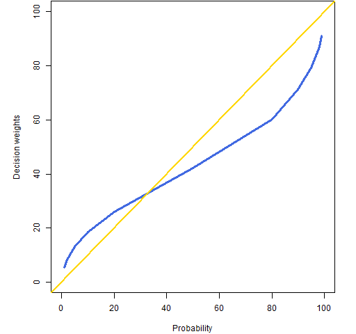
There are two things to notice about Figure 3:
- there is definite bias in the decision weights
- the decision weights don’t go to 0 and 100%
The decision weights at 0 and 100% do correspond to the probabilities, but things get complicated for rare events.
It is hard to assign a unique decision weight to very rare events, because they are sometimes ignored altogether, effectively assigning a decision weight of zero. On the other hand, if you do not ignore the very rare events, you will certainly overweight them. … people are almost completely insensitive to variations of risk among small probabilities. A cancer risk of 0.001% is not easily distinguished from a risk of 0.00001%
Figure 4 shows what Kahneman calls the fourfold pattern: how do we act when facing gains or losses with either high or low probability?
Figure 4: The fourfold pattern. 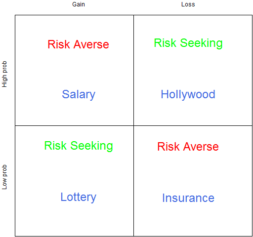
We are most used to thinking about the low probability items. Faced with a low probability of a gain, people buy lottery tickets. Faced with a low probability of a loss, we buy insurance.
We are risk averse when we have a high probability of a gain — we would rather accept a slightly low salary than risk not getting (or continuing) a job.
The top right is what I find most interesting (as does Kahneman). This is the basis of a whole lot of Hollywood movies. When there are no good options, go for broke. If you are being chased by three sets of bad guys, then jump the river in your car.
Our nonlinear attitude towards risk (see the Portfolio Probe review for more on this) means that we are subject to being overly risk averse. We can reject gambles that have a positive expected payoff. That’s okay if there really is only one gamble. But if there is a whole series of gambles, then we need to try to look at the whole set of gambles rather than look at each one in sequence.
Theory-induced blindness
A phrase I love, and that should be used a lot more.
Amos and I stumbled on the central flaw of Bernoulli’s theory by a lucky combination of skill and ignorance. … We soon knew that we had overcome a serious case of theory-induced blindness, because the idea we had rejected now seemed not only false but absurd.
Experiencing and remembering selves
We divide ourselves not only along the lines of System 1 and System 2, but between our experiencing selves and our remembering selves. One would hope that our remembering selves would treat our experiencing selves right. But once again our hopes are dashed — experimenters can get people to do very illogical things by manipulating our weaknesses regarding memory.
Yet more statistical issues
Chapter 21 talks about the case of simple formulas outperforming in-depth analyses by humans. For example, trained counselors predicting students’ grades after a 45 minute interview with each didn’t do as well as a very simple calculation.
The law of small numbers is about failing to take variability into account when sample sizes differ. Are small schools better? Yes. Are small schools worse? Yes.
The illusion of understanding is reading too much into history. This is the central topic of Everything is Obvious.
Video
This video uses the idea of the US grade point average (GPA). For those not familiar with it, the top score is 4.0 — a value that is rarely obtained.
Appendix R
The graphics were done in R.
piecharts
The piechart (Figure 1) was done in an OpenOffice spreadsheet. R will do piecharts, however it makes it hard to separate the labels from the slices as is done with the legend in Figure 1 (but of course it is possible to do in R). The R help file also points to research about perception.
barplot
The R function that created Figure 2 is:
function (filename = "phonebar.png")
 {
    if(length(filename)) {
    png(file=filename, width=512)
    par(mar=c(4,5, 0, 2) + .1)
    }
    barplot(sort(drop(tail(WorldPhones, 1))), horiz=TRUE,
       col="royalblue", las=1, xlim=c(0, 82000))
    box()

    if(length(filename)) {
       dev.off()
    }
 }
dotcharts
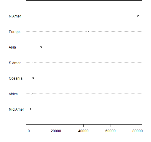
An easier way of getting essentially the same thing as the barchart is:
dotchart(sort(drop(tail(WorldPhones, 1))))
This produces Figure A1.
The dotchart function is more talented than that. Figure A2 was created with:
dotchart(tail(WorldPhones, 3))
Figure A2: A multiperiod dotcchart. 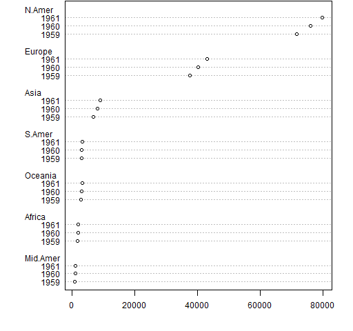
decision weights
The function that created Figure 3 is:
function (filename = "decisionwt.png")
{
    if(length(filename)) {
       png(file=filename, width=512)
       par(mar=c(4,5, 0, 2) + .1)
    }
    probs <- c(1,2,5,10,20,50,80,90,95,98,99)
    dwt <- c(5.5, 8.1, 13.2, 18.6, 26.1, 42.1, 60.1,
       71.2, 79.3, 87.1, 91.2)
    plot(probs, dwt, xlim=c(0,100), ylim=c(0,100), type="l",
       lwd=3, col="royalblue", xlab="Probability",
       ylab="Decision weights")
    abline(0, 1, col="gold", lwd=2)

    if(length(filename)) {
       dev.off()
    }
}
fourfold pattern
Figure 4 was created with:
function (filename = "fourfold.png")
{
    if(length(filename)) {
       png(file=filename, width=512)
       par(mar=c(0,2,2, 0) + .1)
    }
    plot(0, 0, type="n", xlim=c(-1,1), ylim=c(-1,1),
       xlab="", ylab="", axes=FALSE)
    axis(2, at=c(-.5, .5), tck=0, labels=c("Low prob", "High prob"))
    axis(3, at=c(-.5, .5), tck=0, labels=c("Gain", "Loss"))
    box()
    abline(h=0, v=0)
    text(-.5, .8, adj=.5, "Risk Averse", col="red", cex=2)
    text(.5, -.2, adj=.5, "Risk Averse", col="red", cex=2)
    text(-.5, -.2, adj=.5, "Risk Seeking", col="green", cex=2)
    text(.5, .8, adj=.5, "Risk Seeking", col="green", cex=2)

    text(-.5, .3, adj=.5, "Salary", col="royalblue", cex=2)
    text(-.5, -.7, adj=.5, "Lottery", col="royalblue", cex=2)
    text(.5, .3, adj=.5, "Hollywood", col="royalblue", cex=2)
    text(.5, -.7, adj=.5, "Insurance", col="royalblue", cex=2)

    if(length(filename)) {
       dev.off()
    }
}
Updates
Here is a pictorial response to the question from Alan T. The question is essentially: it seems impossible for the IQ of the husband of a bright woman to be below hers while at the same time the IQ of the wife of a bright husband is below his. How is this possible?
Our lack of statistical intuition shines through here, but a picture makes it clear that it actually works that way.
Figure U1: Pretend data of IQ of husbands and wives. 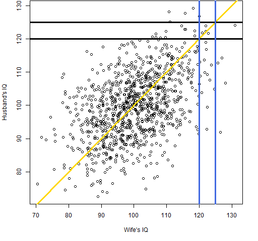
The gold line is the equal IQ line. The blue lines show the values of wives’ IQs between 120 and 125, and the black lines show the values of husbands’ IQs between 120 and 125. Clearly a woman with an IQ of about 120 is very likely to be married to someone with a lower IQ. And the same is true of a man.
The R code to create this was:
require(MASS)
iqcor <- matrix(.5, nrow=2, ncol=2)
diag(iqcor) <- 1
iqsamp <- mvrnorm(1000, mu=c(100, 100), Sigma=100*iqcor)
P.spouseIQ <-
 function (filename = "spouseIQ.png")
 {
    if(length(filename)) {
       png(file=filename, width=512)
       par(mar=c(5,4, 0, 2) + .1)
    }
    plot(iqsamp, xlab="Wife's IQ", ylab="Husband's IQ")
    abline(0,1, col="gold", lwd=3)
    abline(h=c(120, 125), col="black", lwd=3)
    abline(v=c(120, 125), col="royalblue", lwd=3)

    if(length(filename)) {
       dev.off()
    }
 }
We are presuming that the correlations of IQs among spouses is 50% and that the standard deviation of IQs is 10. I have no idea how far off those values are.
The post A statistical review of ‘Thinking, Fast and Slow’ by Daniel Kahneman appeared first on Burns Statistics.
